DevBuild Studio Brand Guidelines
Complete branding guide for DevBuild Studio — colors, typography, logos, icons, and LinkedIn arts.
Last Updated: May 2025
Brand Identity
Brand Essence
DevBuild Studio is a modern learning platform that empowers developers to master cutting-edge skills through expert-led courses and hands-on projects.
Mission: Transform developers' careers through high-quality, practical education.
Brand Personality
- Professional yet approachable
- Modern with a warm touch
- Expert-driven but beginner-friendly
- Innovative while being reliable
Visual Identity
The DevBuild Studio brand uses a sophisticated coffee and cream color palette that evokes warmth, elegance, timelessness, and approachability.
Color Palette
Primary Colors
Brand Primary (Coffee Latte)
Hex: #C17A53
RGB: rgb(193, 122, 83)
HSL: hsl(23, 44%, 54%)
Usage: Primary CTAs, links, highlights, brand elements
Brand Logo (Coffee Mocha)
Hex: #C8794D
RGB: rgb(200, 121, 77)
HSL: hsl(23, 68%, 70%)
Usage: Logo accent, special highlights
Secondary Colors
Cream White
Hex: #FAF8F5
RGB: rgb(250, 248, 245)
HSL: hsl(30, 33%, 97%)
Usage: Backgrounds, light sections
Cream 50
Hex: #F5F1EC
RGB: rgb(245, 241, 236)
HSL: hsl(30, 29%, 95%)
Usage: Subtle backgrounds, cards
Cream 100
Hex: #EBE4D9
RGB: rgb(235, 228, 217)
HSL: hsl(30, 24%, 89%)
Usage: Borders, dividers
Accent Colors
Coffee Espresso
Hex: #1C1816
RGB: rgb(28, 24, 22)
HSL: hsl(30, 8%, 10%)
Usage: Text, dark backgrounds, headers
Coffee 900
Hex: #2D2623
RGB: rgb(45, 38, 35)
HSL: hsl(23, 11%, 16%)
Usage: Dark sections, footer
Accent (Light Coffee)
Hex: #D8A88A
RGB: rgb(216, 168, 138)
HSL: hsl(23, 68%, 70%)
Usage: Hover states, subtle accents
Typography
Logo “dev” Font: Times New Roman MT
dev
Usage: “dev” in logo
Style: Serif, italic, classic
Weight: Regular (400)
Size: 1.15em relative to base
Logo “build.studio” Font: Be Vietnam Pro
build.studio
Usage: “build.studio” in logo
Style: Sans-serif, bold, modern
Weight: Black (900)
Size: 1.1em relative to base
Heading Font: Space Grotesk
The quick brown fox jumps
Usage: Headings, hero text, section titles
Style: Geometric sans-serif
Weights: Medium (500), Semibold (600), Bold (700)
Body Font: Inter
The quick brown fox jumps over the lazy dog. DevBuild Studio empowers developers with expert-led courses.
Usage: Body text, UI elements, navigation
Style: Sans-serif, highly readable
Weights: Light (300), Regular (400), Medium (500), Semibold (600), Bold (700), Extrabold (800)
Alternative Logo Fonts (Available)
Alex Brush
Montserrat
Usage: Alternative options for logo variations
Alex Brush: Script, decorative (400)
Montserrat: Sans-serif, bold (900)
Current Logo Configuration
dev → Times New Roman MT (italic, 1.15em)
build.studio → Be Vietnam Pro (black/900, lowercase, 1.1em)
Technical: Both fonts are sized relative to their container and use baseline alignment for optimal visual balance.
Logo Usage
Primary Logo
Full color with icon and wordmark
Icon Only
Coffee cup icon for small spaces
Wordmark Only
Text logo without icon
Logo Don'ts
- ❌ Don't stretch or distort the logo
- ❌ Don't change logo colors arbitrarily
- ❌ Don't rotate the logo
- ❌ Don't add effects (shadows, outlines, glows)
- ❌ Don't place on low-contrast backgrounds
- ❌ Don't recreate or modify the logo
Custom Line Art Icons
44 custom icons across 7 categories. All icons are minimalist SVG line art, scalable, and adapt to any color via currentColor.
Icon Style Guide
General Education & Development
CodeWindow
Coding/development
GraduationCap
Learning/education
RocketLaunch
Launch/growth
LightbulbIdea
Ideas/innovation
TeamCollab
Collaboration/team
CertificateBadge
Achievement/certification
BookStack
Knowledge/library
PathProgress
Progress/journey
AI & Machine Learning
AIBrain
AI/Neural networks
AIAgent
AI agents/bots
MachineLearning
ML/Training
DataFlow
Data pipelines
NeuralNetwork
Neural networks
ChatBot
Conversational AI
Automation
AI automation
AIModel
AI models
Test Automation
TestRun
Running tests
BugDetection
Bug detection
TestCoverage
Code coverage
ContinuousTesting
CI/CD testing
Career & LinkedIn
TrendingUp
Career growth
CareerMilestone
Milestone/achievement
SkillMeter
Skill progress
MentorshipHandshake
Mentorship/guidance
NetworkGraph
Professional network
ProfileBadge
Profile/identity
DevOps & Cloud
CloudDeploy
Cloud deployment
DockerContainer
Containerization
GitFlow
Git branching
CIPipeline
CI/CD pipeline
ServerCluster
Server infrastructure
APIEndpoint
API design
Content Creation
VideoCamera
Video recording
Microphone
Podcast/voice
LiveStream
Live broadcasting
ContentCalendar
Content planning
PodcastWaves
Audio/waveform
VideoThumbnail
Video thumbnail
Web & Mobile Development
ReactComponent
React/frontend
MobileApp
Mobile app
SecurityShield
Security/auth
PerformanceGauge
Performance
TypeScriptCode
TypeScript
AchievementTrophy
Achievement/award
Usage Example
import { TrendingUp, CloudDeploy, VideoCamera } from '@/components/icons/line-art';

<TrendingUp className="w-16 h-16 text-primary" />
<CloudDeploy className="w-16 h-16 text-primary" />
<VideoCamera className="w-16 h-16 text-primary" />
SVG Icon Arts
Standalone SVG files in public/arts/ — use directly in any HTML, Figma, or video editor. All use brand color #C17A53.
AI / Agent / LLM
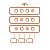
LLM Model
Transformer layers with attention heads
llm-model.svg
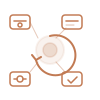
Agent Loop
Think → act → observe agent cycle
ai-agent-loop.svg
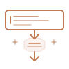
Prompt Engineering
Input → model → output flow
prompt-engineering.svg
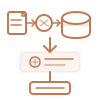
RAG Pipeline
Retrieval-augmented generation
rag-pipeline.svg
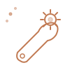
Tool Use
Function/tool calling by LLM
tool-use.svg
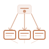
Multi-Agent
Orchestrator + sub-agents
multi-agent.svg
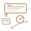
Fine Tuning
Model fine-tuning with loss curve
fine-tuning.svg
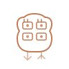
Agent Memory
Memory store/retrieve for agents
agent-memory.svg
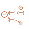
Workflow Automation
Trigger → steps → action pipeline
workflow-automation.svg
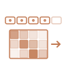
Token Stream
Tokens + attention heatmap
token-stream.svg
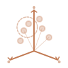
Vector Embedding
3D vector space with clusters
vector-embedding.svg
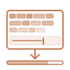
Context Window
Token fill + context limit bar
context-window.svg
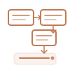
Chain of Thought
Step-by-step reasoning chain
chain-of-thought.svg
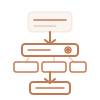
Function Calling
LLM → function → result
function-calling.svg

Model Evaluation
Radar/spider benchmark chart
model-evaluation.svg
Career & Growth
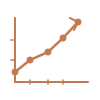
Trending Up
Career growth chart
trending-up.svg
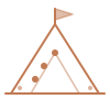
Career Milestone
Mountain peak with flag
career-milestone.svg
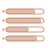
Skill Meter
Skill progress bars
skill-meter.svg
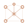
Network Graph
Professional connections
network-graph.svg

Achievement Trophy
Award/completion trophy
achievement-trophy.svg

Profile Badge
Professional identity card
profile-badge.svg
DevOps & Cloud

Cloud Deploy
Upload to cloud
cloud-deploy.svg
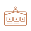
Docker Container
Containerized workloads
docker-container.svg
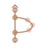
Git Flow
Branch and merge flow
git-flow.svg
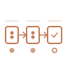
CI Pipeline
Build → test → deploy
ci-pipeline.svg

Server Cluster
Server rack infrastructure
server-cluster.svg
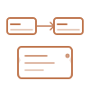
API Endpoint
REST request / JSON response
api-endpoint.svg
Content Creation

Video Camera
Video recording
video-camera.svg

Microphone
Podcast/voice
microphone.svg

Live Stream
Live broadcast screen
live-stream.svg

Content Calendar
Content scheduling
content-calendar.svg

Podcast Waves
Audio waveform + mic
podcast-waves.svg

React Component
React atom / component
react-component.svg

Mobile App
Smartphone with app grid
mobile-app.svg

Security Shield
Auth/security shield
security-shield.svg

Performance Gauge
Speed/performance dial
performance-gauge.svg
Events & Webinars

Location Pin
Map pin / venue
location-pin.svg
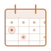
Event Calendar
Highlighted event day
event-calendar.svg
Clock / Time
Analog clock face
clock-time.svg

Webinar Screen
Speaker + audience tiles
webinar-screen.svg
Event Ticket
Ticket with QR code
event-ticket.svg
Countdown Timer
Stopwatch/urgency timer
countdown-timer.svg
Using SVG Arts
<!-- In HTML -->
<img src="/arts/llm-model.svg" width="64" height="64" alt="LLM Model" />

<!-- In Next.js -->
<Image src="/arts/ai-agent-loop.svg" width={64} height={64} alt="Agent Loop" />

<!-- In CSS background -->
background-image: url('/arts/chain-of-thought.svg');
LinkedIn & Video Arts
Ready-to-use SVG backgrounds and banners for LinkedIn profiles, video intros, and social posts. All assets use brand colors and are fully scalable.
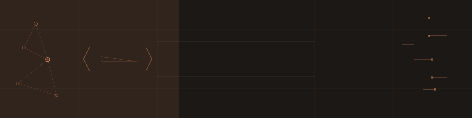
Tech Dark Banner
Dark coffee espresso background with neural network nodes and circuit patterns. Best for tech-focused LinkedIn profiles.
/arts/linkedin-banner-tech.svg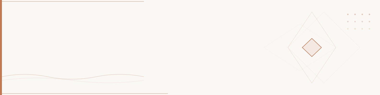
Minimal Cream Banner
Light cream background with geometric diamond pattern. Professional and warm — matches the DevBuild Studio brand.
/arts/linkedin-banner-minimal.svg
Video Intro Background
Full 16:9 dark background with orbit rings and scattered nodes for video intros/outros.
/arts/linkedin-video-intro.svg
LinkedIn Post Background
Open Graph / LinkedIn post background with trending line, hexagon cluster, and code text overlay.
/arts/linkedin-post-background.svgHow to Use LinkedIn Arts
- ✅ Open the SVG in Figma, Inkscape, or any vector editor to add your name/title text
- ✅ Export as PNG at 2x resolution for crisp display on retina screens
- ✅ LinkedIn banner: upload directly at 1584 × 396px
- ✅ Video intro: import into Canva, CapCut, or DaVinci Resolve as background layer
- ✅ Post images: export at 1200 × 627px for best LinkedIn feed display
- ✅ All SVGs can be tinted by changing
#C17A53to any brand color
Brand Voice
Tone of Voice
Professional but Friendly
- ✓ Use clear, direct language
- ✓ Avoid jargon unless necessary
- ✓ Explain technical concepts simply
- ✓ Be encouraging and supportive
Writing Style
- Active voice: “Build real projects” not “Projects will be built”
- Second person: “You'll learn” not “Students will learn”
- Action-oriented: Use strong verbs (Master, Build, Transform)
- Concise: Get to the point quickly
✅ Good Example
“Master modern web development with hands-on projects”
❌ Avoid
“Leverage synergistic learning paradigms for full-stack optimization”
Design Principles
Clarity First
Every design decision should enhance clarity and comprehension.
Warm Professionalism
Balance professional credibility with approachable warmth.
Consistent Spacing
Use 8px grid system: 4px, 8px, 12px, 16px, 24px, 32px, 48px, 64px
Generous White Space
Don't fear empty space — it creates breathing room.
Visual Hierarchy
Use size, weight, and color to guide the eye through content.
Accessibility
Minimum 4.5:1 contrast, clear focus states, semantic HTML.
Questions About Branding?
For branding questions or asset requests, please contact our design team.